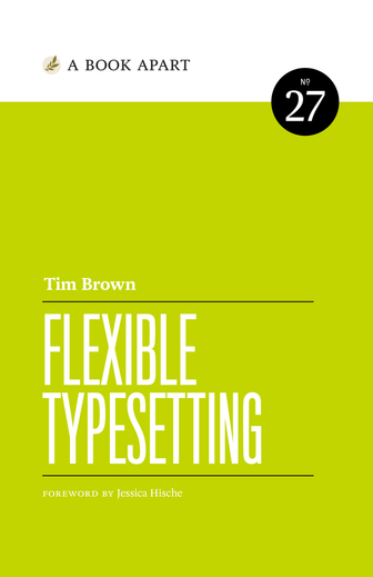
Great typography means success
Type establishes a brand, whether it’s professional or personal. Designers have built careers on the strength of this wisdom, and our traditions are ancient. Unfortunately our tools and techniques are ancient, too. When we design in old ways, it shows.
But when designs flex, they fail
Our creations now encounter an infinite array of screens and people. Careful measurement goes out the window. Fonts are too big, or too small. Text is hard to read. Words break in strange ways. This is not success for anyone. It’s time to rediscover great typography and to see our work clearly.
So I wrote Flexible Typesetting
Originally published in 2018, Flexible Typesetting has sold thousands of copies and given our generation of designers fresh strategies for crafting meaningful, multidimensional typography. It is required reading in elite design programs and has encouraged the rethinking of core curricula.
Read my book now, for free
You and I are living through the biggest change in graphic design history. New devices, screen sizes, and platforms require us to adapt constantly. It’s exhausting. I wrote Flexible Typesetting to aid your practice, offering new mental models for anchoring fluid, responsive design on key typographic guidelines. And I decided to make it free.
